Schalke's club badge is steeped in history, but there are a couple of hidden details which you may have missed.
Schalke have experienced quite the fall from grace in recent years, suffering relegation to the Bundesliga 2 last season.
Meanwhile, they currently sit just three points above the danger zone in the second tier of German football and were held to a 2-2 draw against Furth on Friday.
Advert
However, they remain one of the most supported clubs in the country, having won seven German championships, five DFB-Pokals, one DFB Ligapokal, one DFL-Supercup and one UEFA Cup.
But Schalke was originally a miners club - a tradition they have kept close to their heart, or chest.
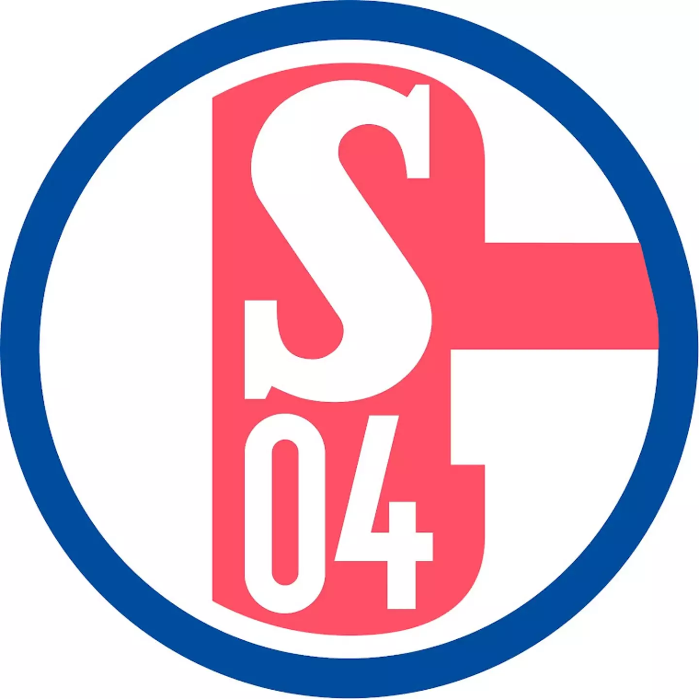
The team's badge is blue and white and includes the letter 'S' in bold writing for Schalke and the numbers '04' in a nod to when the club was founded in 1904.
Advert
But that's not all. The logo also features two key elements which at first glance, are easy to miss.
Those are the letter 'G' and a hammer. The G can be seen in the white background of the logo, while the hammer is blue and includes the 'S04' writing.
You can see the two details below.

But what is the meaning behind the club's hidden details?
Advert
The reason for the 'G' and the hammer is actually very simple. The G is to pay respect to the city of Gelsenkirchen (Schalke's home city) which contributed finances to build Schalke's old stadium, the Glückauf-Kampfbahn, back in 1928
Out of gratitude FC Schalke 04 also changed its name to FC Gelsenkirchen-Schalke e.V.
Meanwhile, the hammer is simply to pay homage to the club's tradition as a mining community.
Both the G and the hammer were far more prominent in times gone by, but today's logo means they are easy to miss.
Featured Image Credit: Getty & Footy HeadlinesTopics: Schalke, Bundesliga, Football, Kit